compelling headlines, CTAs, bullet points, and trust-building elements.
Introduction
Welcome to Part 1 of our ultimate guide on landing page best practices, brought to you by RnD Marketing. Landing pages are the cornerstone of digital marketing, designed to convert visitors into leads or customers with laser-focused precision. When crafted effectively, they can boost conversion rates by up to 220%, making them essential for any growth-focused business. In this first installment, we’ll dive into the foundational elements that make a landing page successful. We’ll discuss topics such as crafting compelling copy, designing for conversions, ensuring a seamless user experience, and creating clear calls-to-action. By mastering these basics, you’ll lay a strong foundation for turning clicks into conversions. Let’s get started!
Crafting Compelling Copy and Headlines
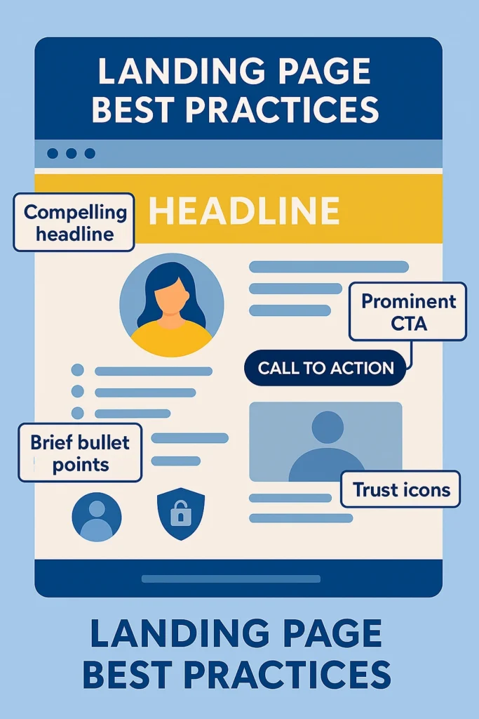
When it comes to landing page best practices in copywriting, clarity and relevancy are king. Your headline and supporting text must immediately communicate your value proposition. Remember, you only have a few seconds to hook a visitor. A strong headline that speaks to the visitor’s needs or pain point will grab attention and encourage them to keep reading. It’s crucial to match the headline to the ad or email that brought the visitor – this message match assures them they’re in the right place. Include a clear value proposition near the top, explaining what you offer and why it’s valuable. For example, instead of a vague tagline, explicitly state the benefit or outcome your product/service delivers.
Writing Concise and Persuasive Copy
Keep the copy concise and user-focused. Only about 20% of people will read beyond the headline of a page, so make sure your key message is front and center. Use short paragraphs or bullet points to highlight benefits. It’s often effective to phrase content in terms of the customer (“you”) and how you solve their problem, rather than talking too much about “we” (your company). Focus on benefits over features – explain how your offering improves the user’s life or business. Supporting points like testimonials or data can reinforce credibility, but avoid overwhelming the reader with dense text. In fact, landing pages with minimal, concise text (and a clear call-to-action) convert about 34% better than text-heavy pages. This doesn’t mean removing important information – it means distilling your message to the most persuasive essentials.
Structuring Your Copy for Scannability
Consider using subheadings and bold text to call out key points for scanners. Every section of copy should support the page’s single goal, and any extraneous info should be cut. Also, maintain a consistent tone that fits your brand and audience – whether that’s friendly and casual or formal and professional. Consistency builds trust. Finally, don’t forget to proofread. Typos or grammatical errors can hurt credibility on a page where you’re asking visitors to take action. By following these landing page best practices for copywriting, you’ll create pages that resonate with your audience and drive conversions.
Clean and Conversion-Focused Design
Great copy will fall flat if your design is confusing or unappealing. One of the core landing page best practices is to design for clarity and focus. Use a clean, uncluttered layout that guides the eye to the most important elements. Plenty of white space is your friend – it helps important content (like your headline and CTA button) stand out. Stick to a simple color scheme that aligns with your branding but also provides contrast for calls-to-action (for example, a bright accent color on your CTA against a neutral background). Ensure your fonts are legible and consistent; headings should be larger and bold for hierarchy, while body text should be easy to read.
The Role of Visuals in Engagement
High-quality visuals can significantly boost engagement. An eye-catching hero image or illustration at the top of the page can help communicate your offer at a glance. Ideally, the image should relate directly to your product or service. For instance, showing your product in use or depicting an aspirational outcome. Visual cues can also direct attention: images of people looking toward your form or arrows pointing to the CTA can subconsciously guide visitors. Remember that humans are drawn to human faces, so using photos with people (e.g., a happy customer using your product) can make the page feel more relatable. Engaging visuals aren’t just cosmetic; they help keep visitors on the page. Studies have found that including relevant images and graphics can increase the time visitors spend on a landing page by up to 50% – giving your message more time to sink in.
Creating a Conversion-Centered Layout
While designing, maintain consistency with your brand’s look and feel (colors, style, imagery) to reinforce trust. If your ad or social post had a certain visual style, carry that over to the landing page so visitors feel a cohesive experience. One advanced design practice is to use a conversion-centered layout – this means arranging elements so that the page naturally draws attention toward the conversion goal. For example, keep important content above the fold (visible without scrolling) whenever possible, including your headline, key benefits, and CTA button. Use contrast, large buttons, and perhaps directional cues (like arrows or an image of a person pointing) to make it unmistakably clear what action the visitor should take. By designing with a conversion focus, you’ll prevent users from getting lost or distracted.
Streamlined UX and Mobile Experience
User experience (UX) can make or break your landing page’s performance. Even if your copy and design are strong, a confusing or slow page will drive visitors away. One of the top landing page best practices for UX is to eliminate anything that could distract or frustrate the user. Unlike a homepage, a landing page should usually remove the main site navigation and external links. By minimizing distractions, you keep visitors focused on the single conversion goal at hand. Additionally, ensure the page is easy to scan – use clear section headings, short blocks of text, and obvious clickable buttons. A visitor should be able to grasp your offer and how to act on it within seconds of landing.
Optimizing for Mobile Users
The mobile experience deserves special attention as well. More than half of web traffic now comes from mobile devices, and 86% of top-performing landing pages are optimized for mobile users. This means your page must be mobile-responsive – layouts should adapt to smaller screens, text should remain readable without zooming, and buttons should be large enough to tap easily. Test your landing page on a smartphone and tablet to ensure everything looks and works great (forms, videos, etc.). Mobile users also tend to be more impatient with loading and scrolling, so put your most compelling content at the top and consider using shorter sections or accordion-style content if necessary. Also, avoid any elements that don’t work on mobile (like Flash, or hover-dependent menus). A smooth mobile UX not only pleases users but is also rewarded by Google in search rankings (thanks to mobile-first indexing).
Form Optimization for Better Conversions
Another UX best practice is optimizing your forms and input fields. If your landing page’s goal is lead generation (form fill-out), keep the form as short and simple as possible. Every additional form field you ask for will increase friction. In fact, one study found that landing pages with 5 or fewer fields have 120% higher conversion rates than pages with more lengthy forms. Only ask for the information you truly need on that first interaction – you can always collect more details later. Use clear labels and error messages on the form to prevent user frustration. And consider the placement: generally, a form above the fold or triggered by a prominent button works well. The easier and more intuitive the experience, the more likely visitors are to convert.
In summary, simplify the user journey. Make sure your landing page loads fast and is easy to navigate (or rather, has nowhere else to navigate). Also, it should guide the visitor step-by-step toward conversion without confusion. Test the page yourself (and ask others) to ensure that nothing is ambiguous or cumbersome.
Clear and Compelling CTAs
Your Call-to-Action (CTA) is arguably the most important element of a landing page. After all, this is the button or link that converts a visitor into a lead or customer. Effective CTAs are a cornerstone of landing page best practices. Start by having one primary CTA focus. high-converting pages are laser-focused on a single offer or action, rather than giving multiple choices. If you have several CTAs or links (like “Buy Now” and “Learn More” and “Contact Us”), you risk distracting or confusing your audience. Decide on the one thing you want users to do, and center your page around that. (If you need secondary actions, such as a “No, thanks” link or an alternate conversion like a newsletter signup, make them far less visually prominent than the main CTA.)
Designing Effective CTA Buttons
Make your CTA button stand out with design. Use a contrasting color that draws the eye (it should differ from your background and other elements). The button should be large enough to notice immediately, and it should look like a clickable button. Place it in a highly visible spot. ideally near the top of the page as part of the hero section, and again lower on the page if it’s long. Repeating the same CTA multiple times on a long-scrolling landing page is fine (even wise) as long as it’s the same primary action. For example, you might have a “Sign Me Up” button after the intro and another at the bottom after a detailed benefits section, to catch those who scroll.
Drafting Persuasive CTA Copy
Equally important is the CTA copy (text). It should be clear, action-oriented, and aligned with the offer. Use strong verbs and reinforce what the user is getting. Instead of a generic “Submit”, say “Get My Free Ebook” or “Start My Free Trial”. Create a sense of benefit or urgency if appropriate (e.g. “Download Now”, “Claim My Spot”). Keep it brief – 2-5 words is usually plenty. The goal is that when a visitor reads the button, they know exactly what will happen when they click it. If your CTA is clear and compelling, you’ll likely see a significant uptick in clicks – in fact, landing pages with obvious, clear CTAs convert up to 3× more than those with unclear or hidden CTAs.
For further CTA optimization, consider any accompanying text or microcopy. For instance, if your offer is a free trial signup, a short line beneath the button like “No credit card required” can reduce friction. If it’s a download, mentioning file size or format can be helpful. Also, ensure the button link works correctly and leads to the intended next step (form submission, checkout, etc.), and track those clicks for analytics. By focusing on a singular, well-designed CTA with persuasive text, you make it as easy as possible for visitors to take that crucial next step.
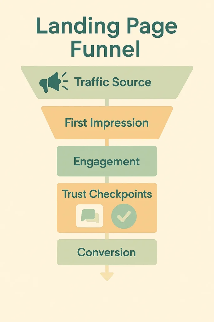
from traffic source to conversion with trust and engagement steps.
Conclusion
In this first part, we’ve explored the foundational landing page best practices. We’ve talked about crafting copy, designing for clarity & focus, ensuring a seamless UX across devices, and creating compelling cta’s. By implementing these strategies, you’ll build landing pages that engage visitors and drive conversions. Stay tuned for Part 2, where we’ll dive into advanced techniques – optimizing page speed, testing for continuous improvement, and building trust with your audience. Ready to start creating high-converting landing pages? Contact RnD Marketing to learn how our experts can help you craft pages that deliver results!
FAQs
Q1: What makes a good landing page headline?
A good landing page headline is clear, compelling, and directly addresses the visitor’s needs or pain points. It should quickly convey your value proposition and align with the ad or link that brought the visitor to the page. For example, if your ad promises a free trial, the headline should reinforce that offer to ensure message consistency.
Q2: Why is mobile optimization critical for landing pages?
Mobile optimization is critical because over half of web traffic comes from mobile devices. Users expect seamless experiences on smaller screens. A mobile-optimized landing page adapts layouts, ensures readable text without zooming, and provides easy-to-tap buttons, boosting conversions. Google’s mobile-first indexing also rewards mobile-friendly pages with better search rankings.
Q3: Where should I place my CTA on a landing page?
Your CTA should be prominent and placed above the fold for immediate visibility, ideally in the hero section. Repeating the CTA lower on longer pages ensures users who scroll can easily take action. Clear design, such as contrasting colors and large buttons, makes the CTA stand out and encourages clicks.